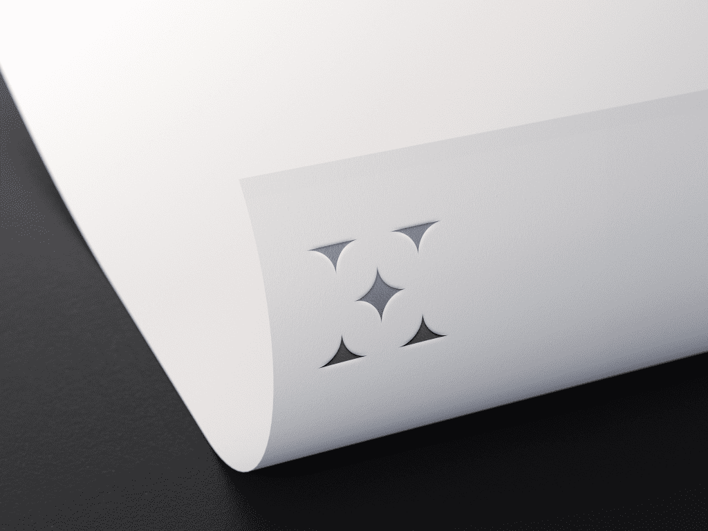
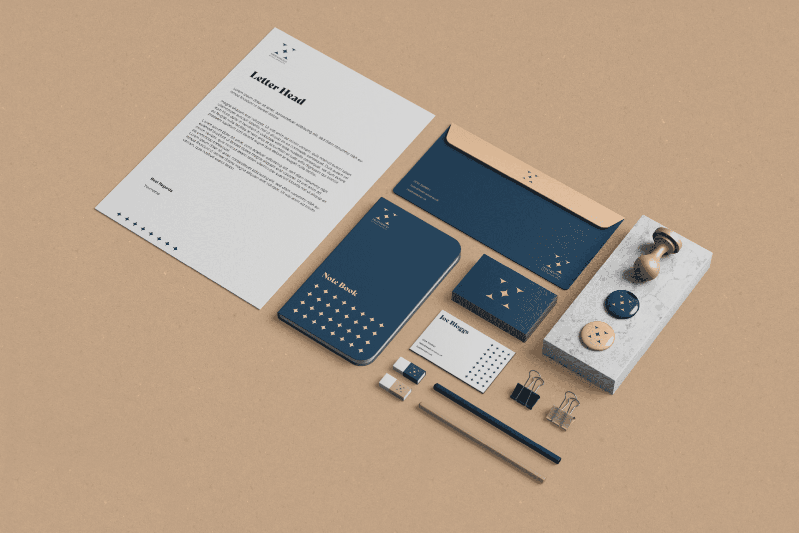
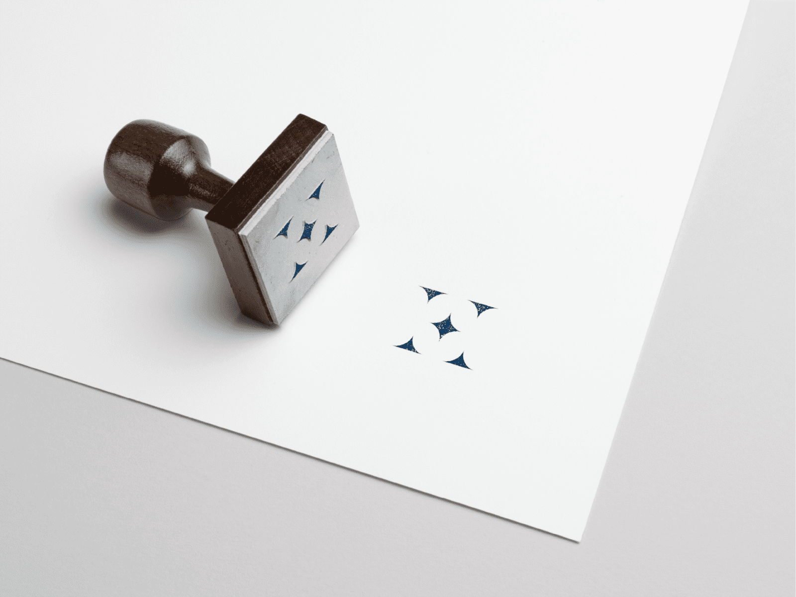
Heathwood Developments needed a new identity to help to position themselves in the marketplace.
The brief was simple, and the client really leaned on us and our creative team to bring several concepts to the table. The Heathwood ‘H’ consists of simple and basic shapes, which make for a classic-looking mark. The colours contrast each other well and make for a perfect blend of modern sophistication.
BRAND identity
abstract + clean
We utilised the shapes from the logo construction to create a pattern asset that can be used as part of the design system which makes up the visual identity.


