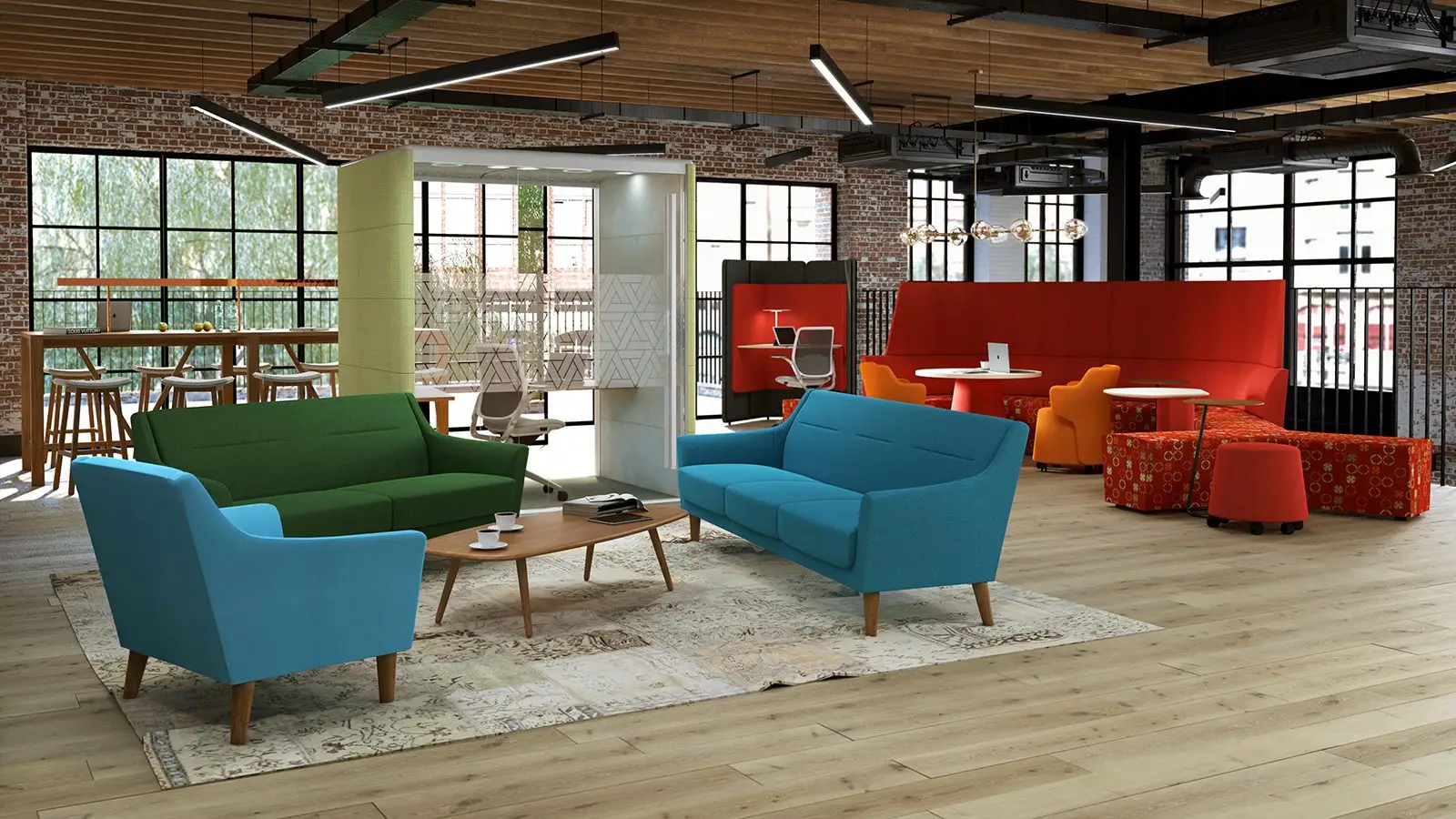
Active Workplace Group needed a new brand that matched their energy. We delivered a bold identity, sleek website, and vibrant collateral — built to turn heads and let their personality shine.
Active came to us with a clear goal: evolve their brand to better reflect who they are today. They were after something bold, professional, and full of character — without losing the human touch. We explored a range of creative directions, landing on a look and feel that balances energy with clarity, and sets them up for the next stage of growth.
We customised a typeface to inject Active’s unique personality into their visual identity — striking the perfect balance between playful and professional. It’s bold, characterful, and designed to help them stand out in a crowded industry.
The three dots represent their core service pillars, while a vibrant, energetic yellow brings their creativity and optimism to life. The ‘dancing A’s’ reflect their dynamic mindset — always thinking differently, always moving forward. It’s a brand that doesn’t just look the part — it tells the Active story, loud and clear.