Developing a strong and clean visual identity for a fast growing construction brand.
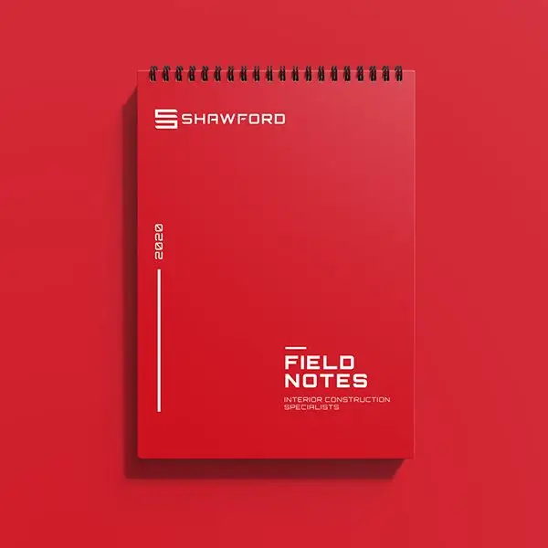
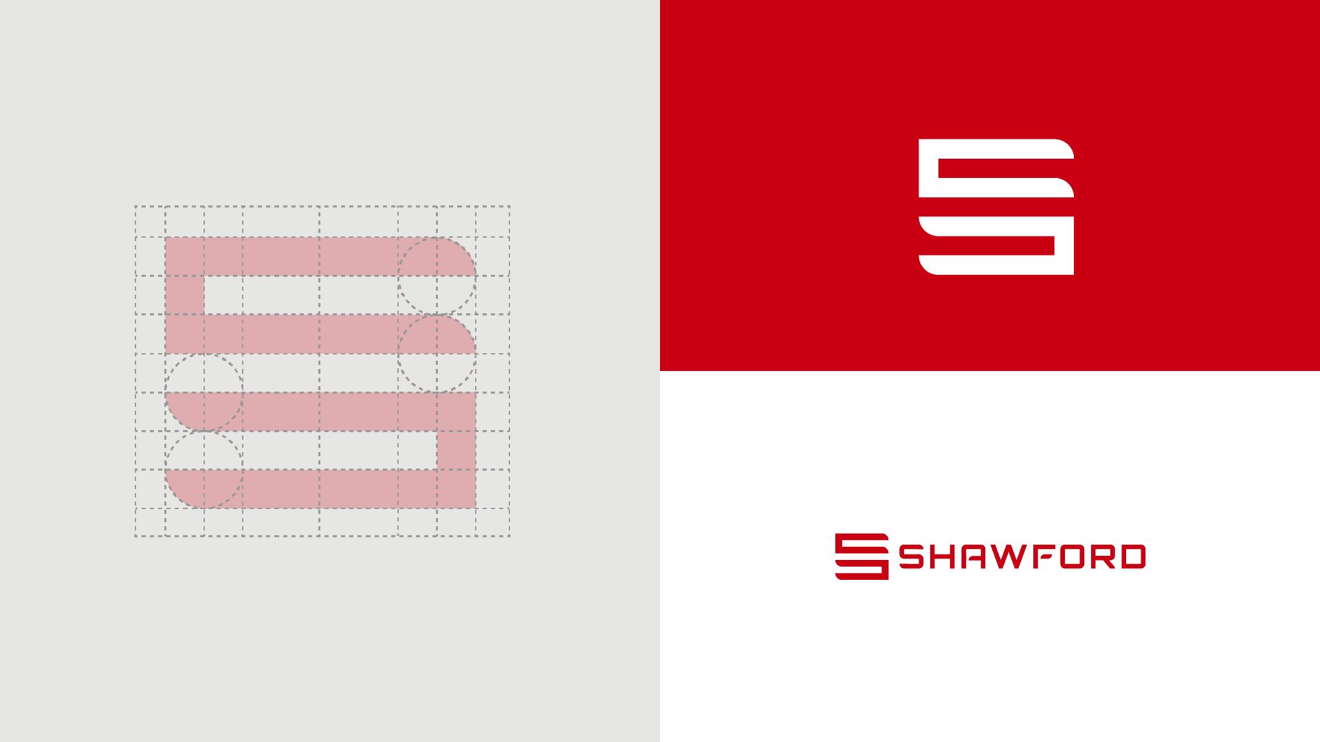
Shawford Interiors needed a memorable and sharp-looking brand to help them win more work and get their name out there in the competitive world of construction. The brief was simple, they needed a clean and modern logo that works in a digital and real-world landscape. The ‘S’ was inspired by the sharp lines and curves that you see within interiors. The colours were inspired by the big brands you see on-site, such as Hilti and Milwaukee tools.
BRAND identity
STRONG +
SLEEK
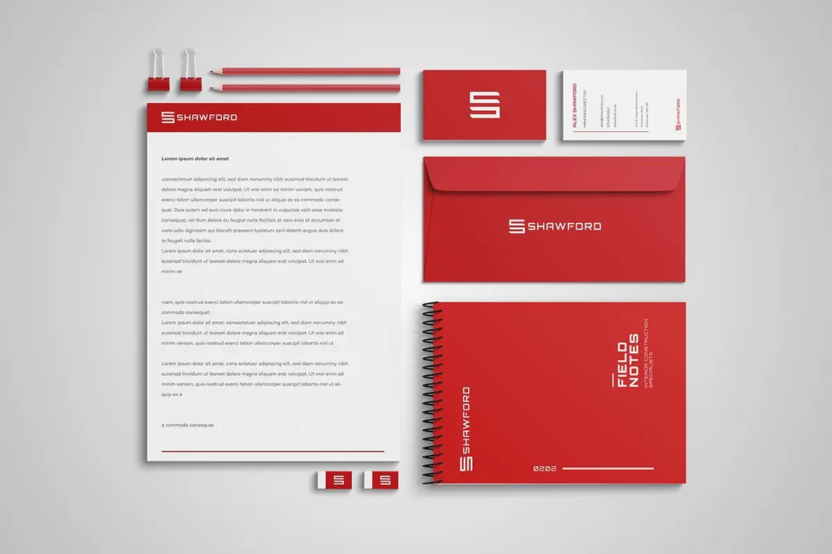
The visuals as a whole needed to be simple, the overall aesthetic and guide was made to represent professionalism. The logo needed to work on a plethora of different mediums, meaning the mark itself had to work in small and large spaces, online and off.


DIGITAL
Experience
focused
We helped create a simple and effective brochure-type website, aligned with their new branding and visuals it made for an effective user experience.


