


#pixelpower
Blak Island
Blak Island
Client
Liam Morgan
Account Manager
Creative
Services
Brand & Identity
Deliverables
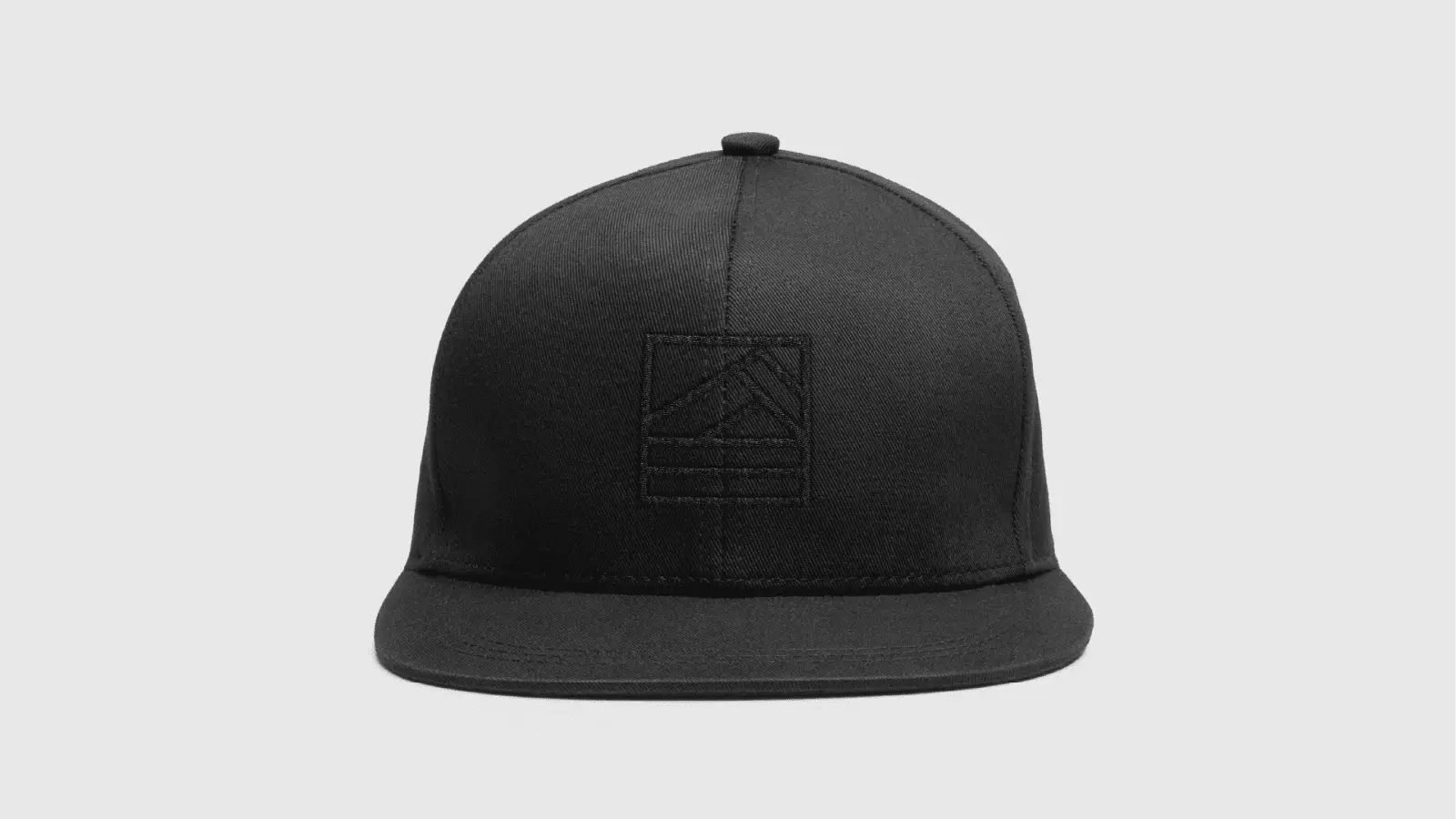
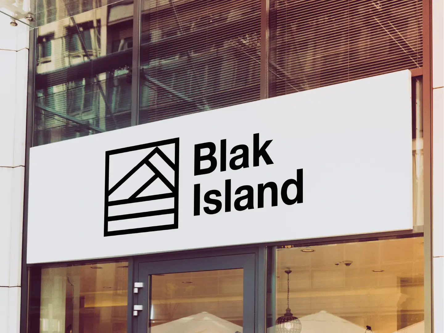
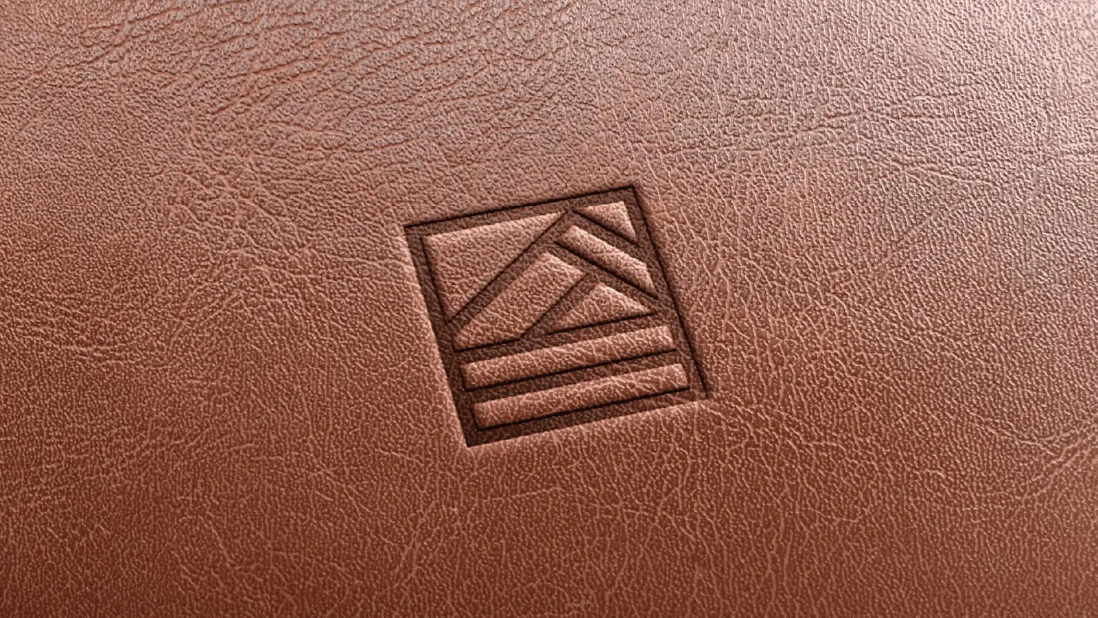
A start up fashion brand needed a simple but effective visual identity.
Blak Island wanted a logo mark that represents a mountain but in an abstract form. The line style mark was created, and the the simple Helvetica typeface sits nicely along side. The shape is neat and compact making it effective and fitting for various uses. The colours are simple, the whole aesthetic works well and has a great stance In the market.


